Typography.

Our type is modern, flexible, and rational — conveying information in a clean and simple way without being distracting or obtrusive. Our typeface is called Graphik.
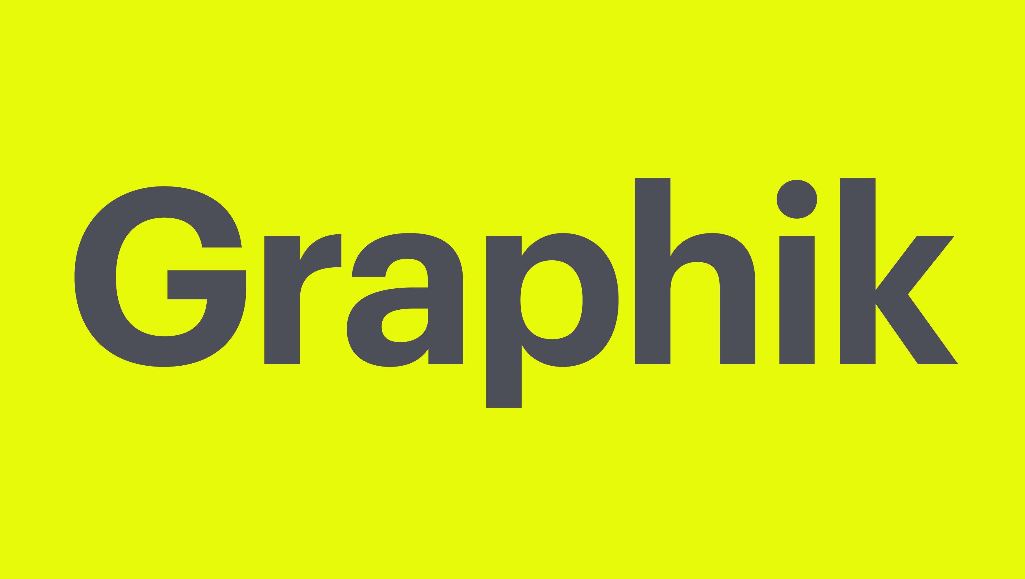
To obtain a copy of the typeface, please reach out to the Material Bank Brand Team.

Character set.

This is what Latin characters look like in Graphik. This typeface also supports Arabic, Cyrillic, Hebrew, and Greek characters. For other alphabets, designers and developers should use the closest available approximation.

Uppercase

ABCDEFGHIJKLMNOPQRSTUVWXYZÀÁÂÃÄĀĂÅǺĄÆǼĆĈČĊÇĎĐÐÈÉÊĚËĒĔĖĘĜĞĠĢĤĦÌÍÎĨÏĪĬİĮIJĴĶĹĽĻŁĿŃŇÑŅŊÒÓÔÕÖŌŎŐØǾŒÞŔŘŖŜŠŚŞȘẞŤȚŢŦÙÚÛŨÜŪŬŮŰŲẀẂŴẄỲÝŶŸŹŽŻ

Lowercase

abcdefghijklmnopqrstuvwxyzàáâãäāăåǻąæǽćĉčċçďđðèéêěëēĕėęĝğġģĥħìíîĩïīĭıįijĵȷķĺľļłŀńňñņŋòóôõöōŏőøǿœþŕřŗśŝšşșßťțţŧùúûũüūŭůűųẁẃŵẅỳýŷÿźžż

Numerals and Fractions

1234567890¼½¾⅓⅔⅛⅜⅝⅞

Punctuation and Symbols

(¡¿!?.:,;…)[&&@#]{-–—|¦·}‹›«»‘’“”‚„'"•/\&‰©℗®™°§¶*†‡#№

Mathematical Symbols and Currencies

+−±×÷=≠≈<>≤≥¬∞~^µ∫Ωπ∂∆∏∑√◊$¢£¥€ƒ¤

Weights.

Graphik supports a wide range of widths and weights. 
Our brand identity uses only Graphik Regular and Graphik Semibold.

Usage.

See examples below of weights in situ. In general, use Graphik Semibold for any copy larger than 20px in size. For anything smaller, use Graphik Regular to maximize legibility and clarity. Headlines should be sentence case with the period at the end.

Headline (Graphik SemiBold)

Search and sample in seconds.

Subheader, Short Paragraphs (Graphik SemiBold)

Lorem ipsum dolor sit amet, consectetur adipiscing elit, sed do eiusmod tempor incididunt ut labore et dolore magna aliqua. Ut enim ad minim veniam, quis nostrud exercitation ullamco.

Body Copy Above 20px (Graphik SemiBold)

Lorem ipsum dolor sit amet, consectetur adipiscing elit, sed do eiusmod tempor incididunt ut labore et dolore magna aliqua. Ut enim ad minim veniam, quis nostrud exercitation ullamco laboris nisi ut aliquip ex ea commodo consequat. Duis aute irure dolor in reprehenderit in voluptate velit esse cillum dolore eu fugiat nulla pariatur. Excepteur sint occaecat cupidatat non proident, sunt in culpa qui officia deserunt mollit anim id est laborum.

Body Copy Below 20px (Graphik Regular)

Lorem ipsum dolor sit amet, consectetur adipiscing elit, sed do eiusmod tempor incididunt ut labore et dolore magna aliqua. Ut enim ad minim veniam, quis nostrud exercitation ullamco laboris nisi ut aliquip ex ea commodo consequat. Duis aute irure dolor in reprehenderit in voluptate velit esse cillum dolore eu fugiat nulla pariatur. Excepteur sint occaecat cupidatat non proident, sunt in culpa qui officia deserunt mollit anim id est laborum. Lorem ipsum dolor sit amet, consectetur adipiscing elit, sed do eiusmod tempor incididunt ut labore et dolore magna aliqua. Ut enim ad minim veniam, quis nostrud exercitation ullamco laboris nisi ut aliquip ex ea commodo consequat. Duis aute irure dolor in reprehenderit in voluptate velit esse cillum dolore eu fugiat nulla pariatur. Excepteur sint occaecat cupidatat non proident, sunt in culpa qui officia deserunt mollit anim id est laborum.

Setting type.

Setting type in a way that is clear, clean, and authoritative is crucial to a positive user experience. Here you’ll find some rules that dictate the way copy should look.

Tracking

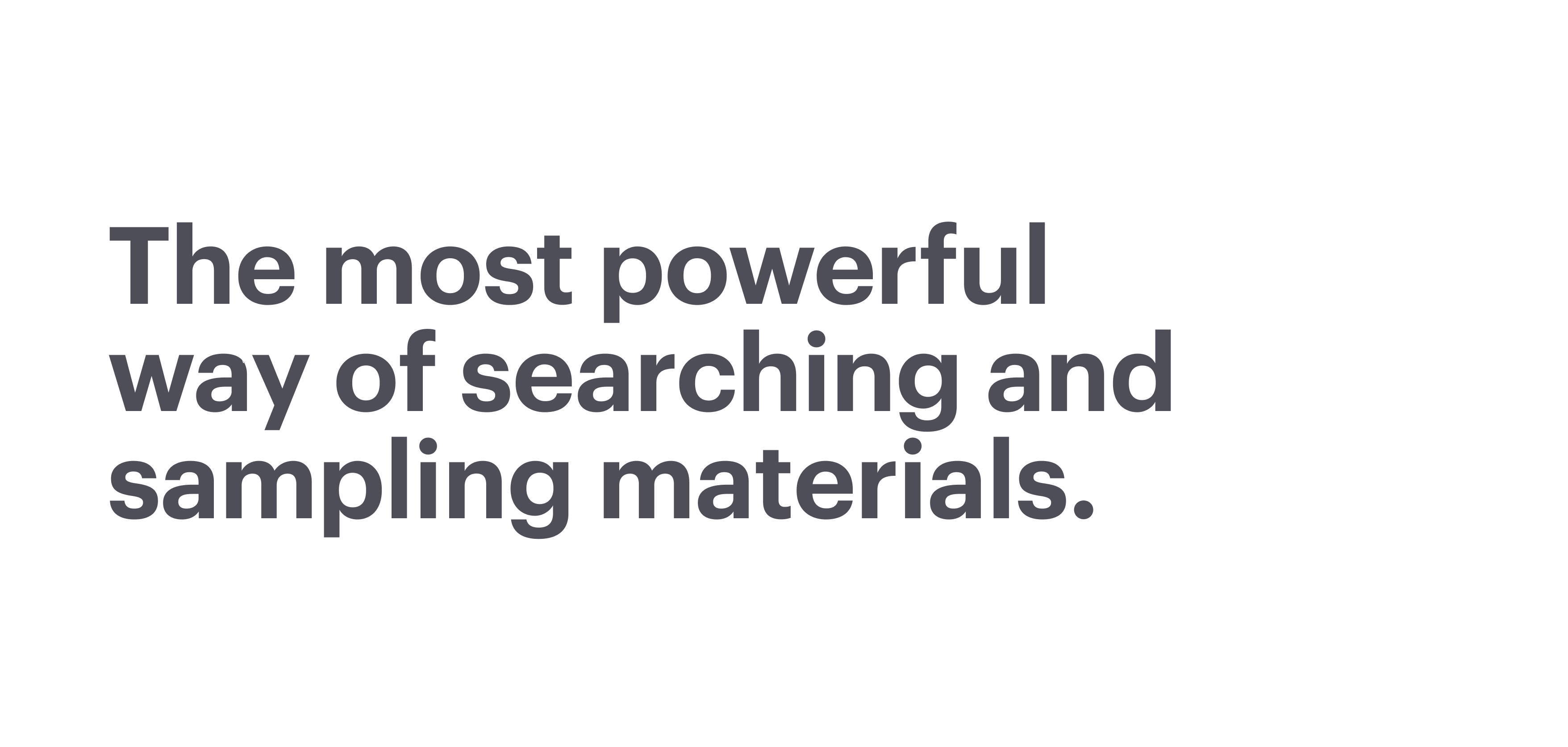
Tracking is the amount of space given to a piece of copy. In brand-consistent use, tracking should be generally tight. It shouldn’t be too tight or too loose, per the examples below.

Leading

Leading is the space between one line and the next. As an optical rule of thumb, keep leading greater than spaces between words, and keep spaces between words greater than tracking. This creates a smooth experience on the part of the reader.
Alignment

Alignment refers to the flow of text on a page and where its edges are flush. Always use left-aligned or centered typography.

Examples