Logo.
Architectural and dynamic, the Material Bank logo is a signature of our brand. To ensure consistency across platforms, applications, and contexts, we follow these guidelines.

Symbol.
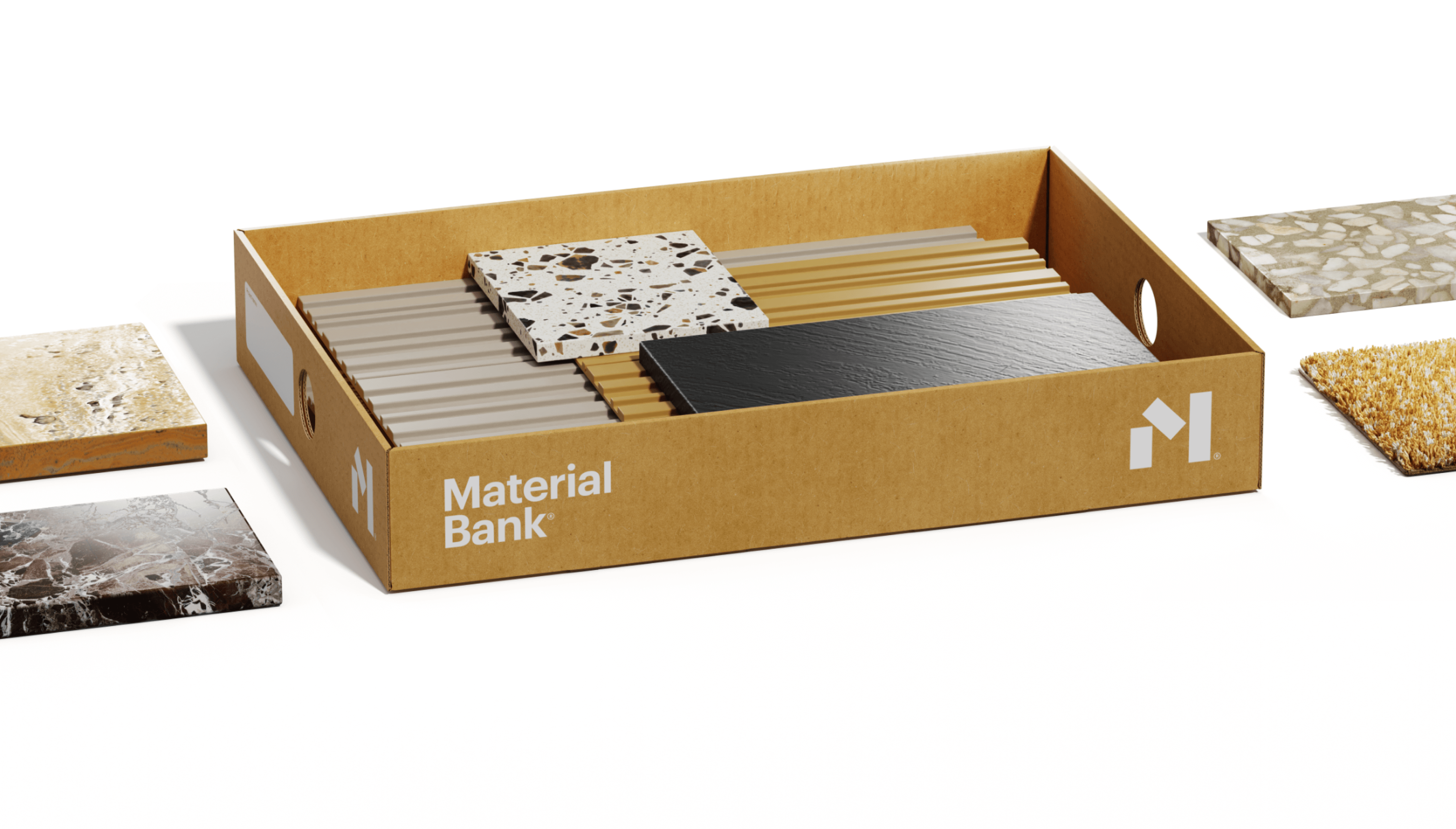
Our symbol is composed of the distinguished letter "M." This iconic symbol holds the power to transform various facets of our brand's presence and identity, making it a versatile asset. Whether we're talking about packaging, brand merchandise, advertising campaigns, or social media outreach, the "M" is at the core of our visual identity system.

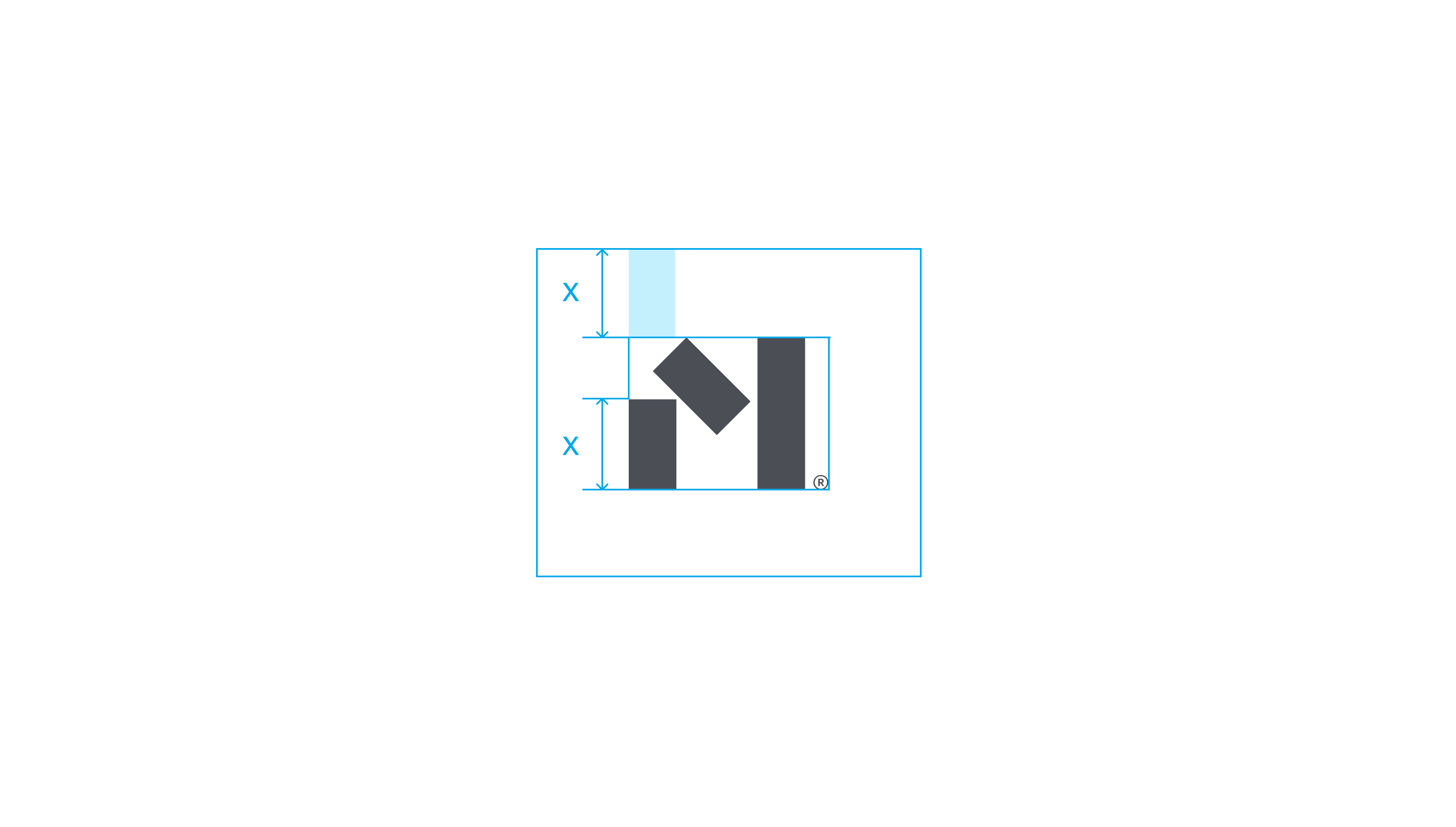
Clear space.
In application, the logo deserves its own space — whether it’s from the margins of a page or other graphic elements. The clear space is proportional to the logo itself, as indicated below.

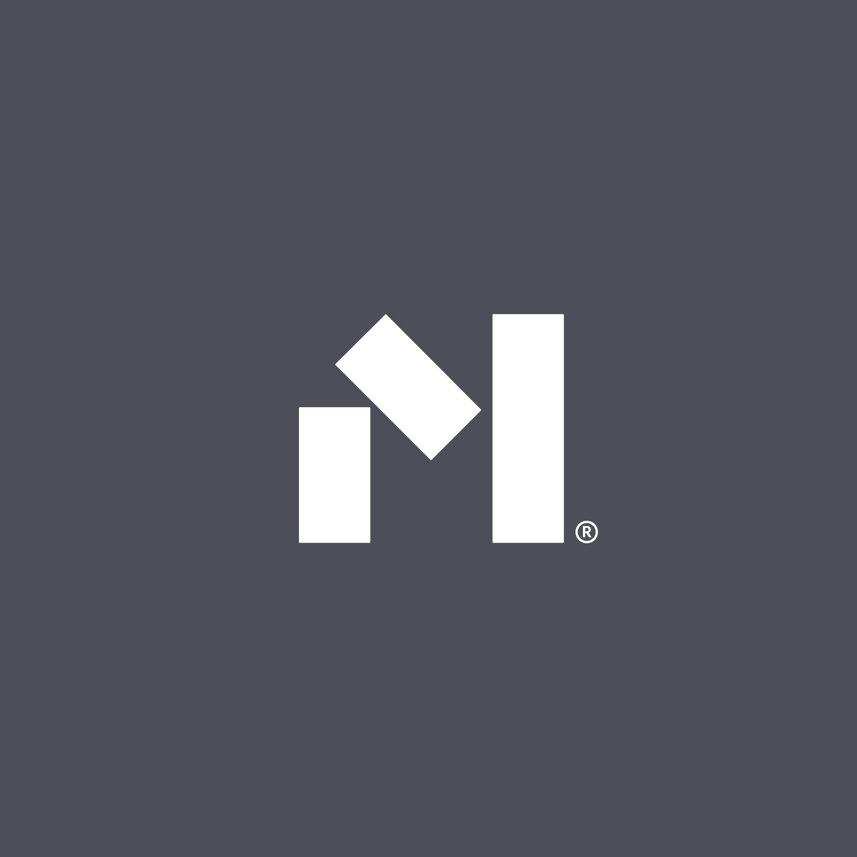
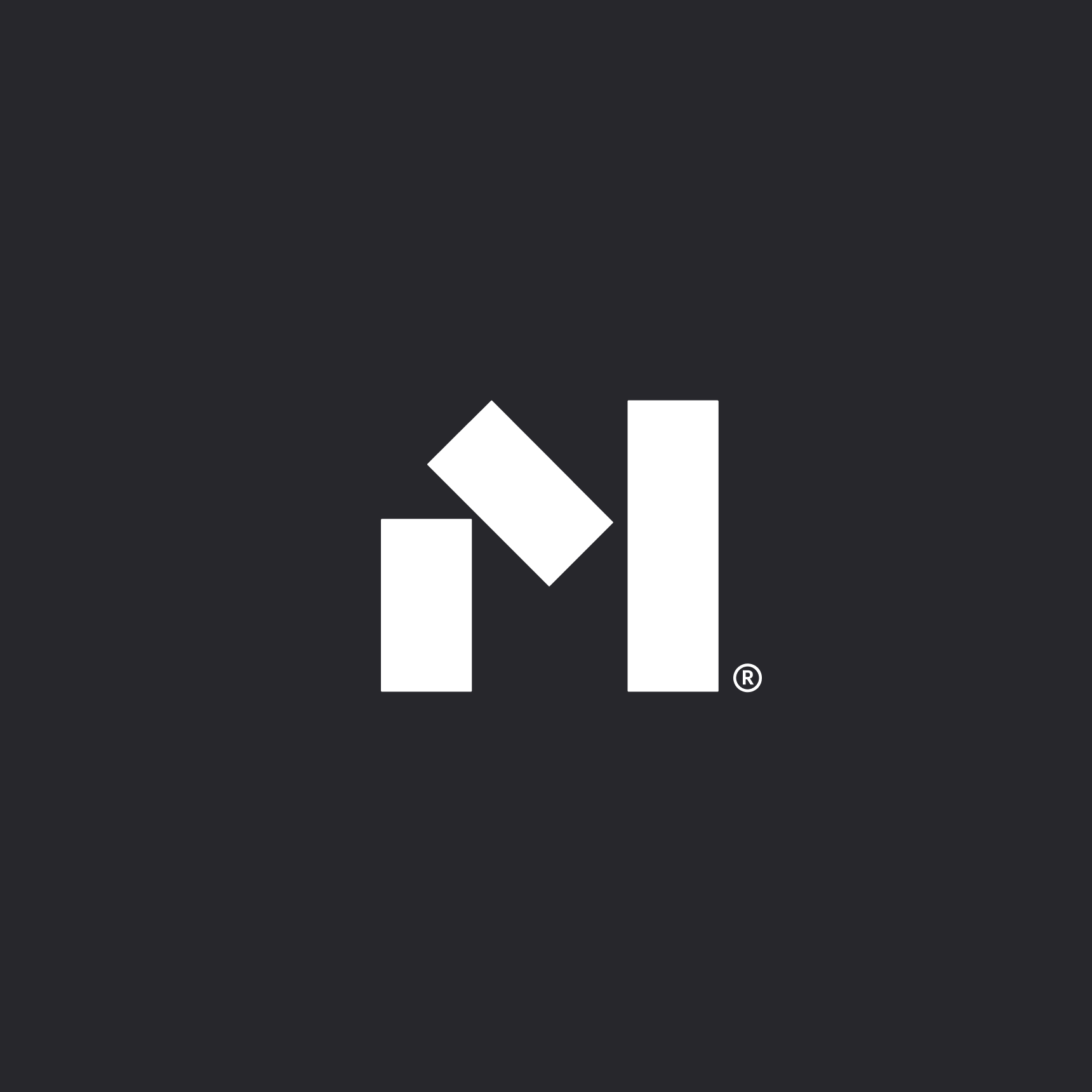
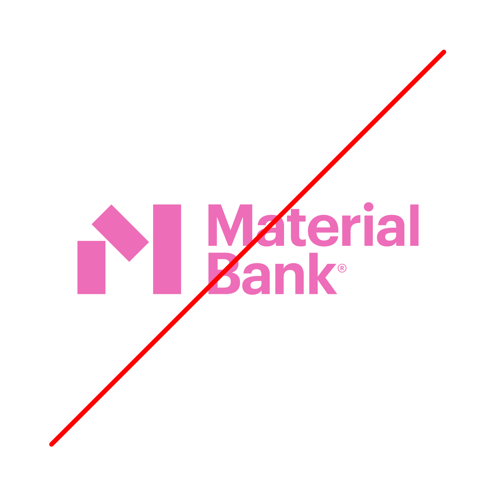
Color options.
It’s important not to stray from our primary or secondary color palettes. These are the only brand-consistent combinations permitted for use. When applying the logo over imagery, be sure there’s enough contrast for the logo to be clearly legible.


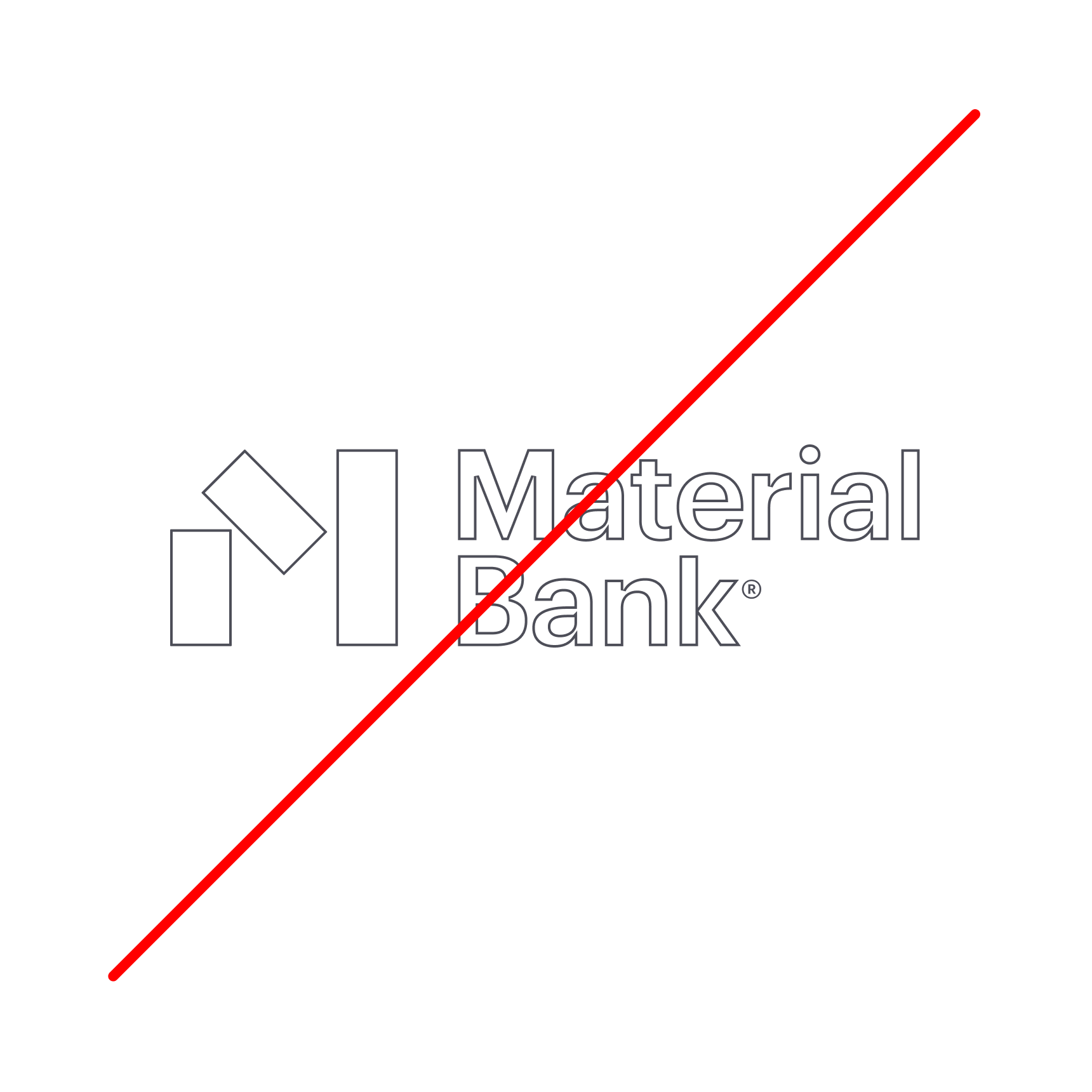
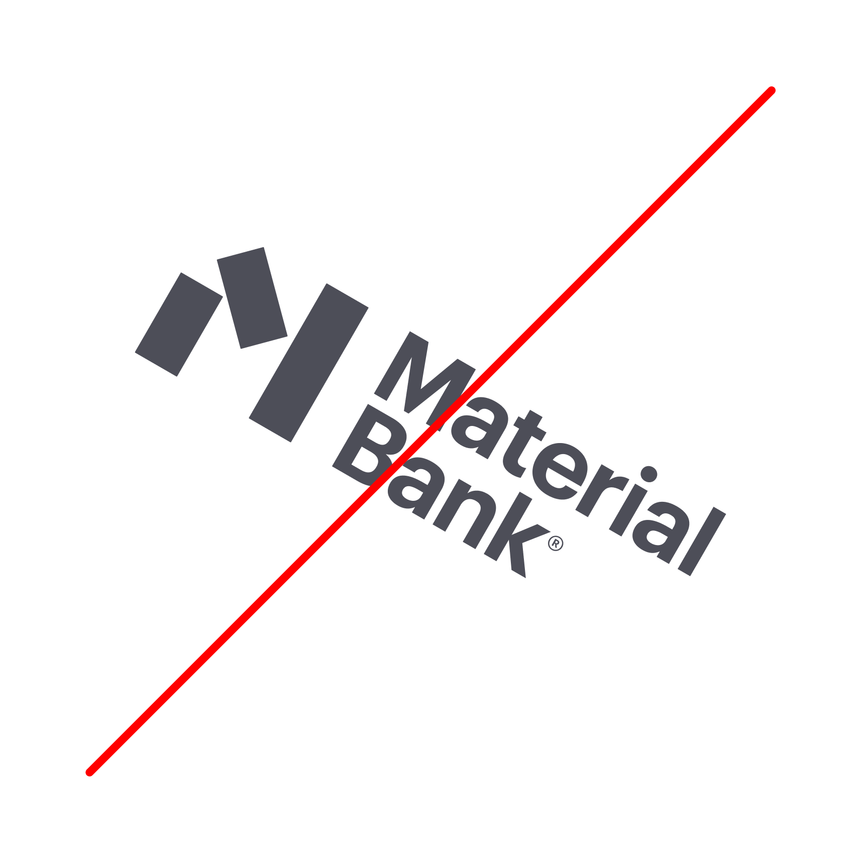
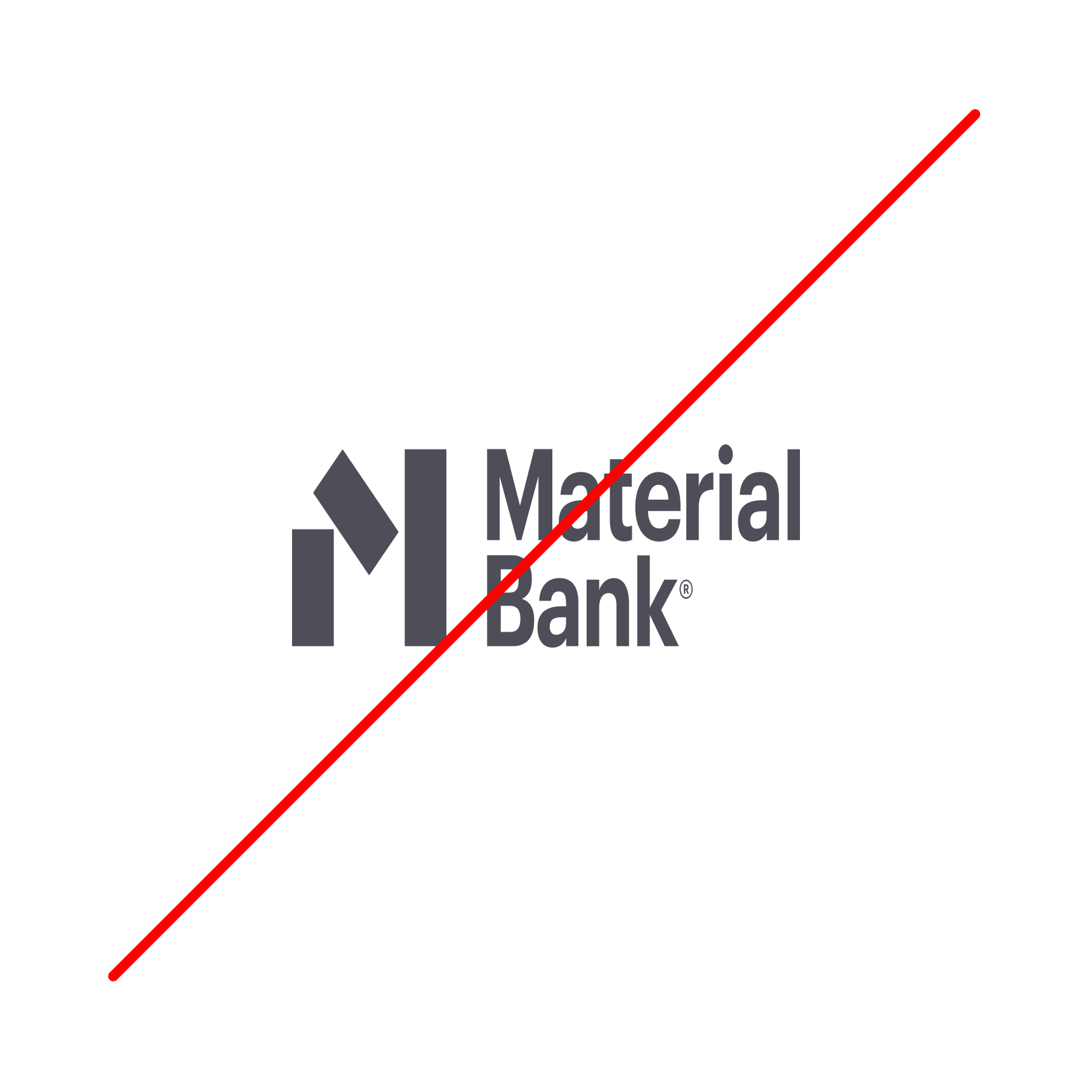
Logo misuse.
As the key component of our visual identity — our most recognizable asset — our logo needs to always maintain consistency. Please do not alter or modify it in any way.


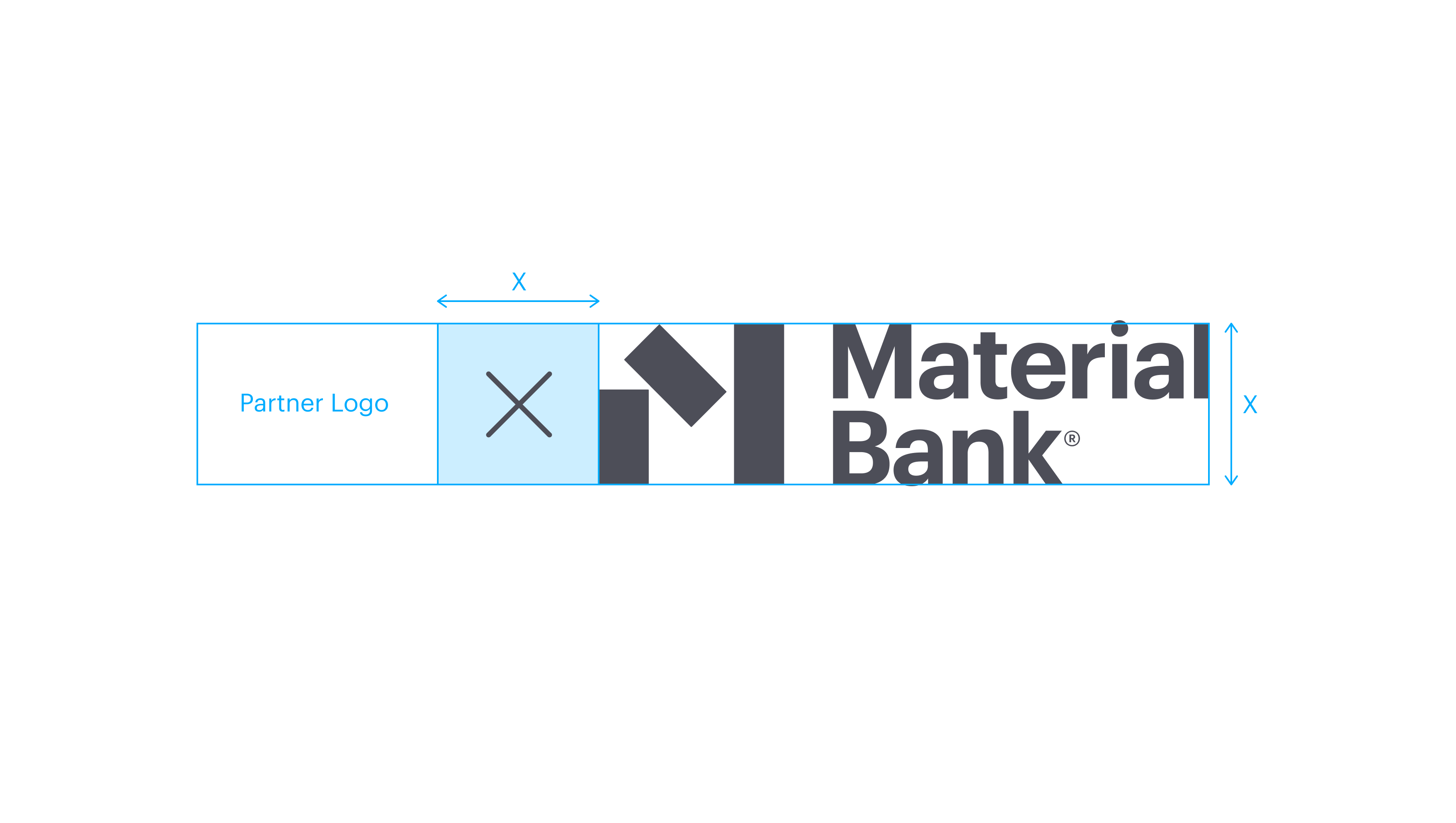
Co-branding.
When placing the Material Bank logo adjacent to a Brand Partner logo, please ensure the horizontal clear space is equal to the height of the logo itself. Never place the Material Bank logo next to the logo or wordmark of a competitor.
Scalability.
The logo has been designed and tested for use across a wide range of sizes. We’ve determined that its minimum legible height is 20px. Please do not resize the logo to be any smaller so as not to compromise its legibility.

Icons.
Appropriate icons feature a white Material Bank logo on a dark gray field. Depending upon context, the logo may be shaped as a circle, a square with rounded corners, or a square.